Full-Channel Product Launch · SHED
A story you can sip.
How I took a supplement from zero to launch across strategy, copy, Meta Ads, email, SMS, landing page, and creative.
How I took a supplement from zero to launch across strategy, copy, Meta Ads, email, SMS, landing page, and creative.

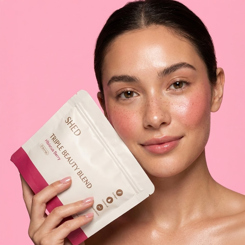
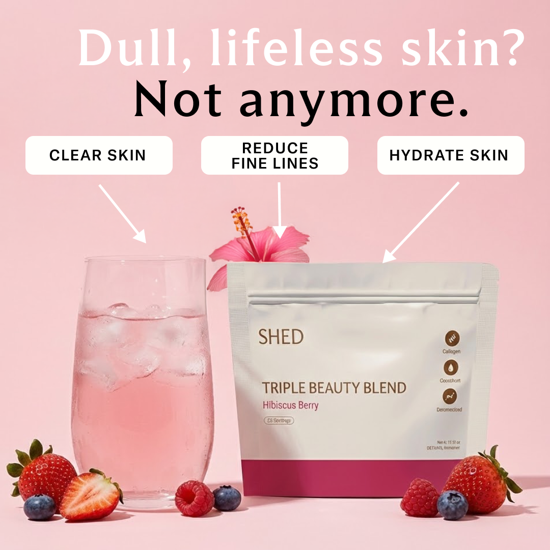
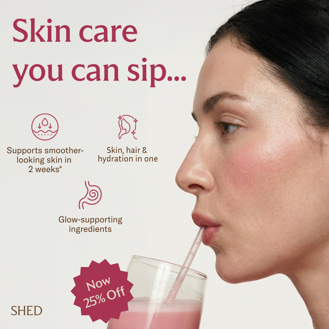
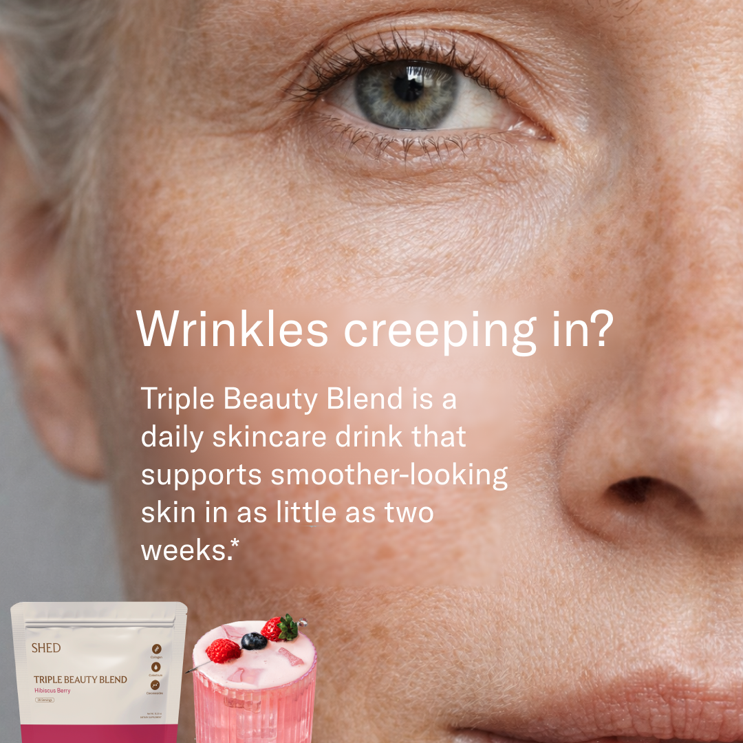
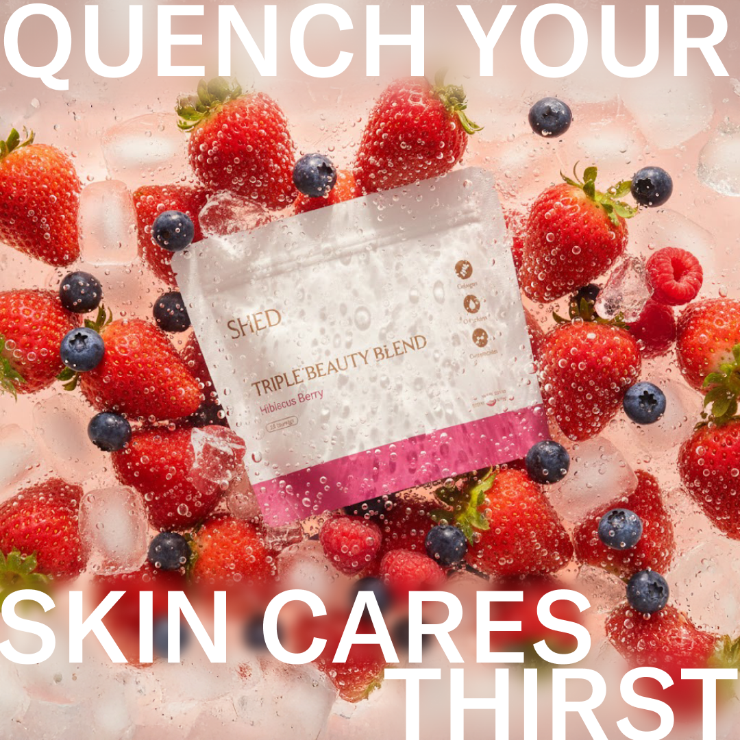
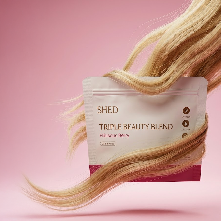
I built the entire launch from scratch. Positioning, copy, creative, and every channel. The angle: beauty supplements are not skincare you swallow. They are daily rituals you actually look forward to. "Skincare you can sip" became the through-line across every touchpoint.
I wrote and designed the landing page, produced all ad creative using AI-assisted workflows, built the Omnisend email sequences, set up Postscript SMS campaigns, and ran Meta Ads targeting cold and warm audiences.
"The best launches don't just announce a product. They give people a reason to care."
Meta Ads. Ran cold prospecting and retargeting across Facebook and Instagram. Designed all static and motion creative. Wrote every headline and body copy variant.
Email & SMS. Built the launch sequence in Omnisend (announcement, education, social proof, last chance) and Postscript SMS flows. Wrote all copy and designed all templates.